Designing a Playful logo for a concert venue fry stand.
CATEGORY
Branding, Food
TOOLS
Illustrator
Frites and Greet
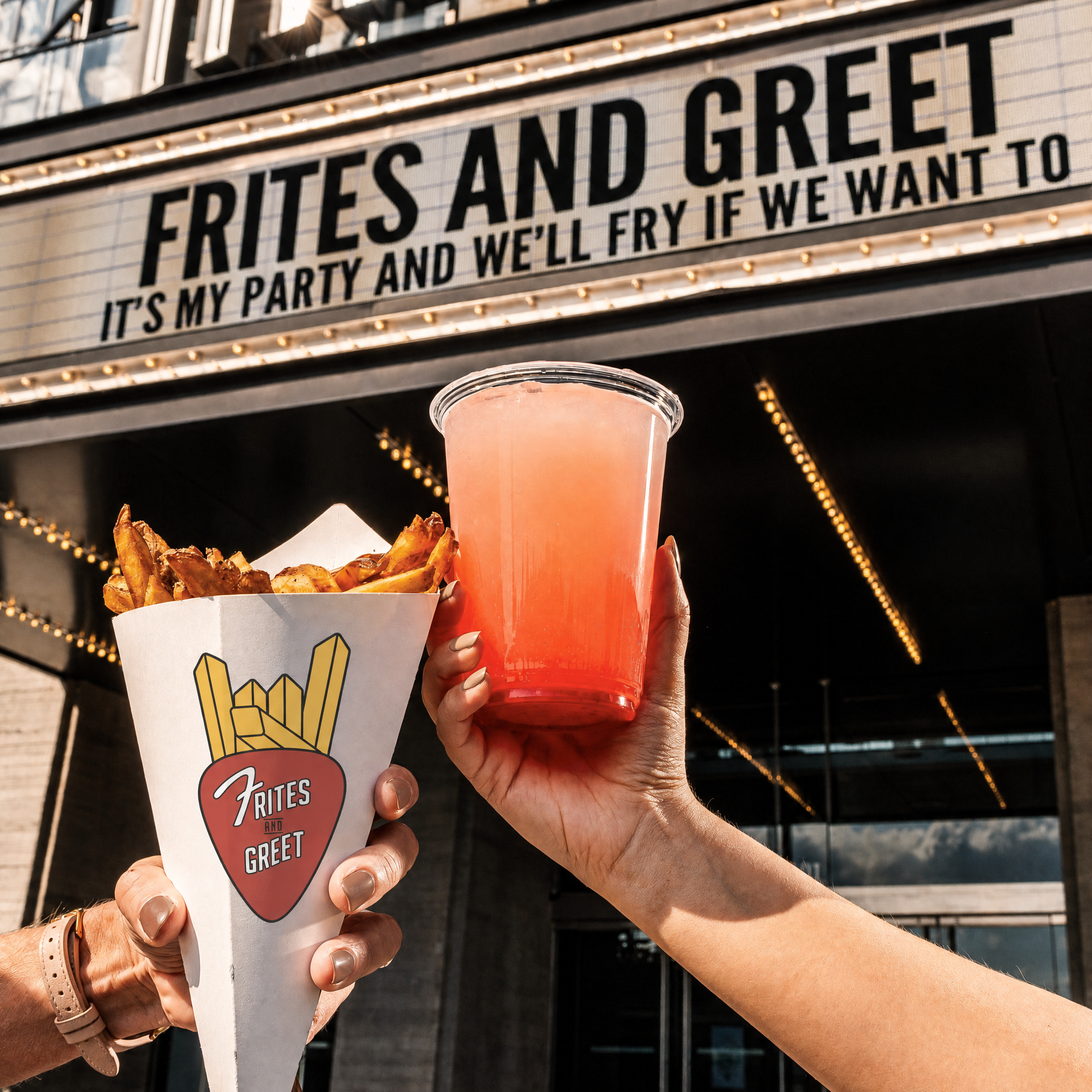
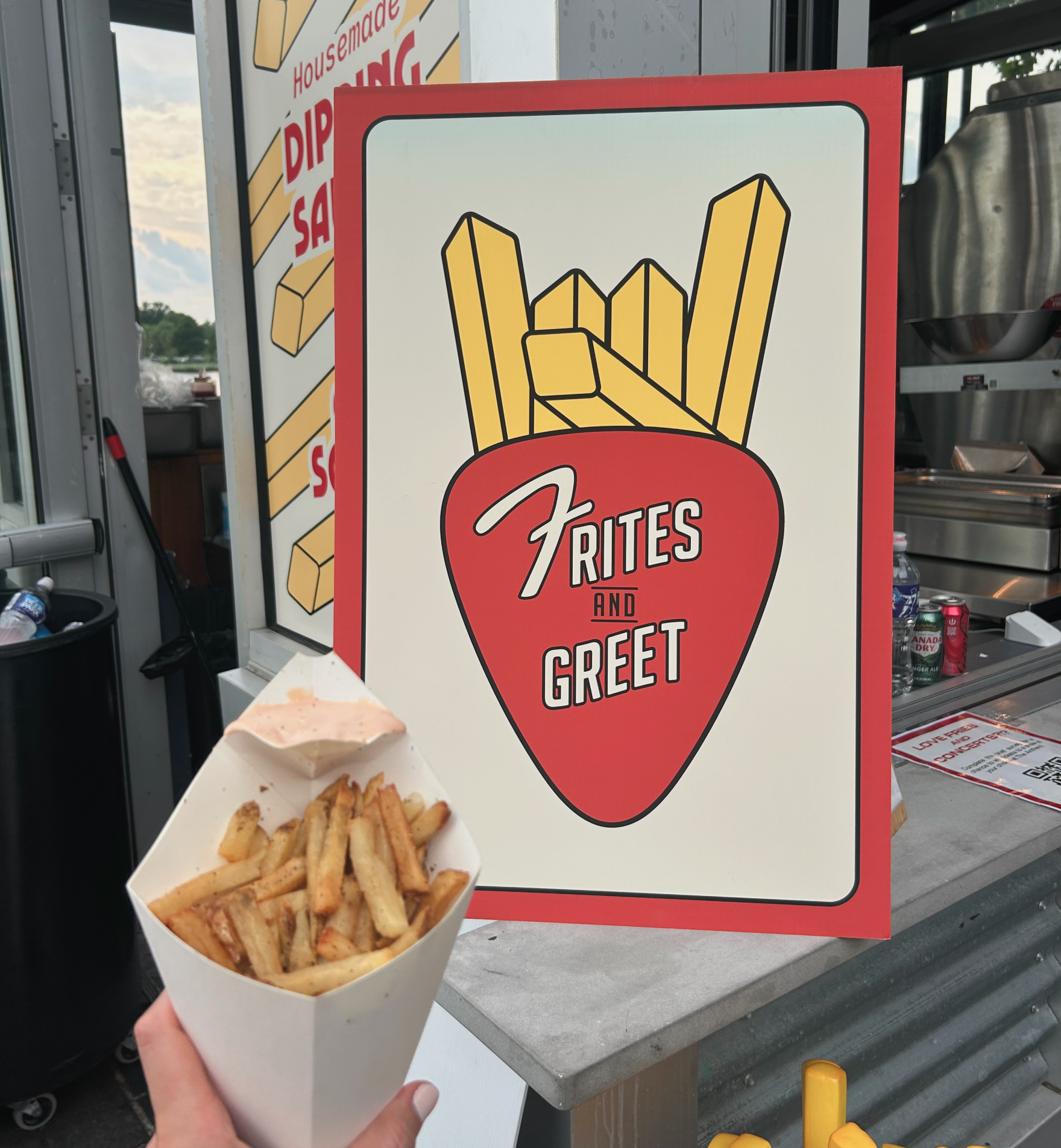
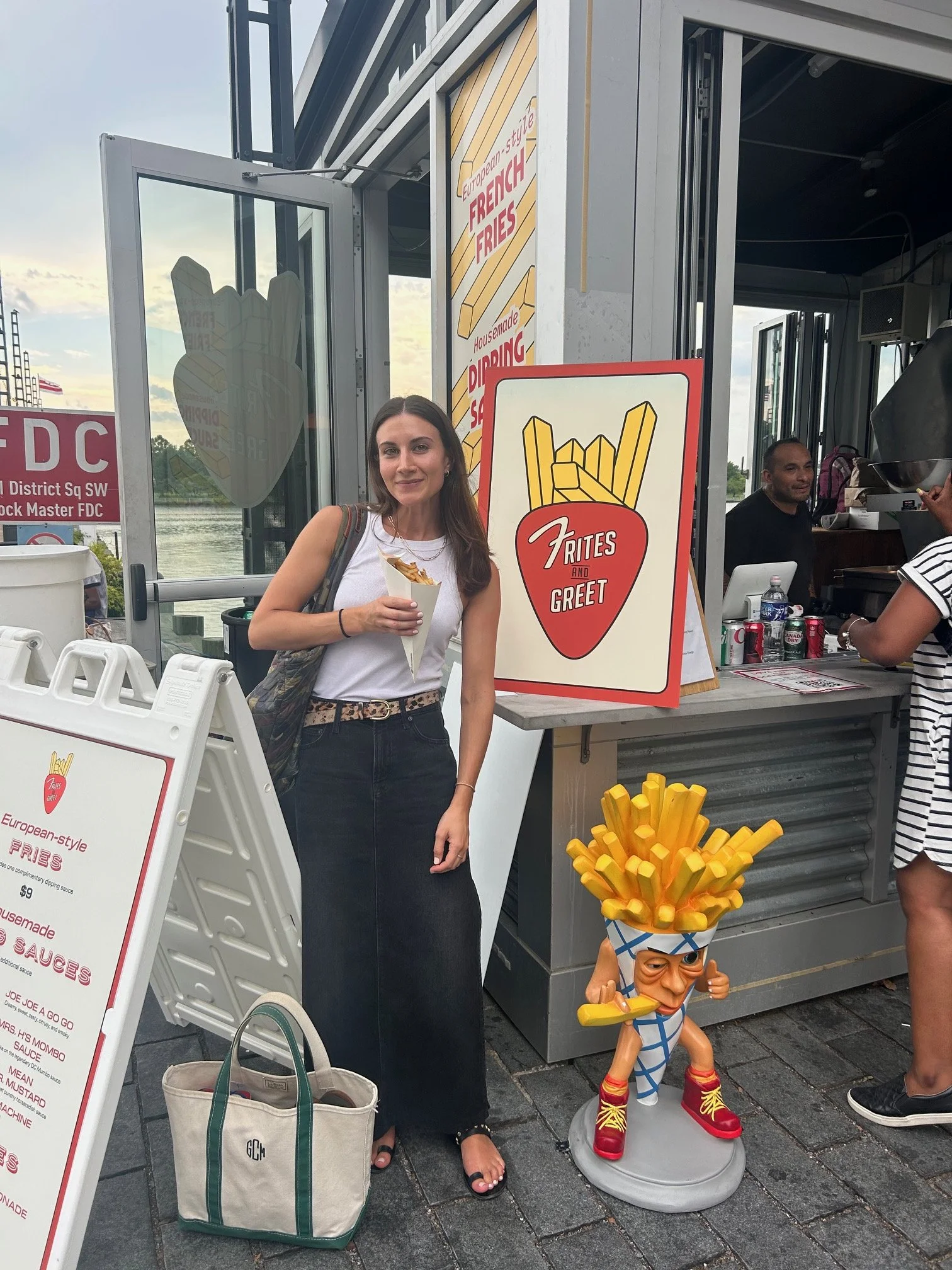
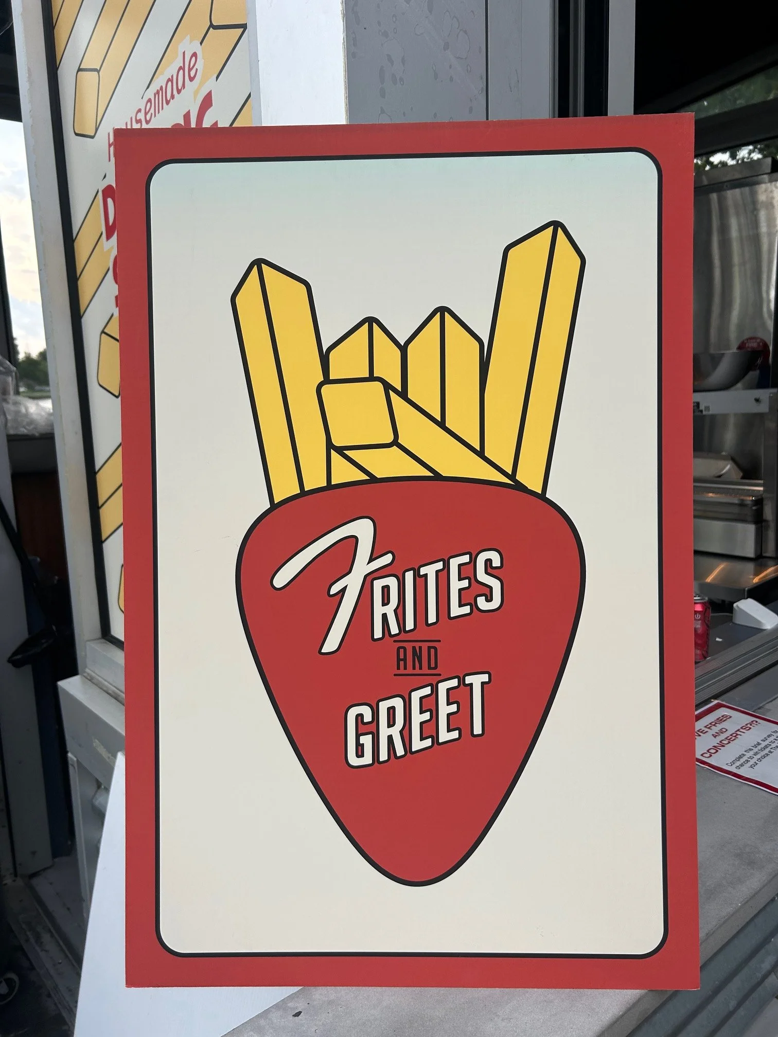
Frites and Greet is a fry stand outside of The Anthem that mixes concert energy with late-night fries. The project had been in the works for a while as a passion project for a friend of mine, and after the first logo he received didn’t quite match the vision, he brought me in to help refine the direction and bring more personality into the brand.
HOW IT STARTED
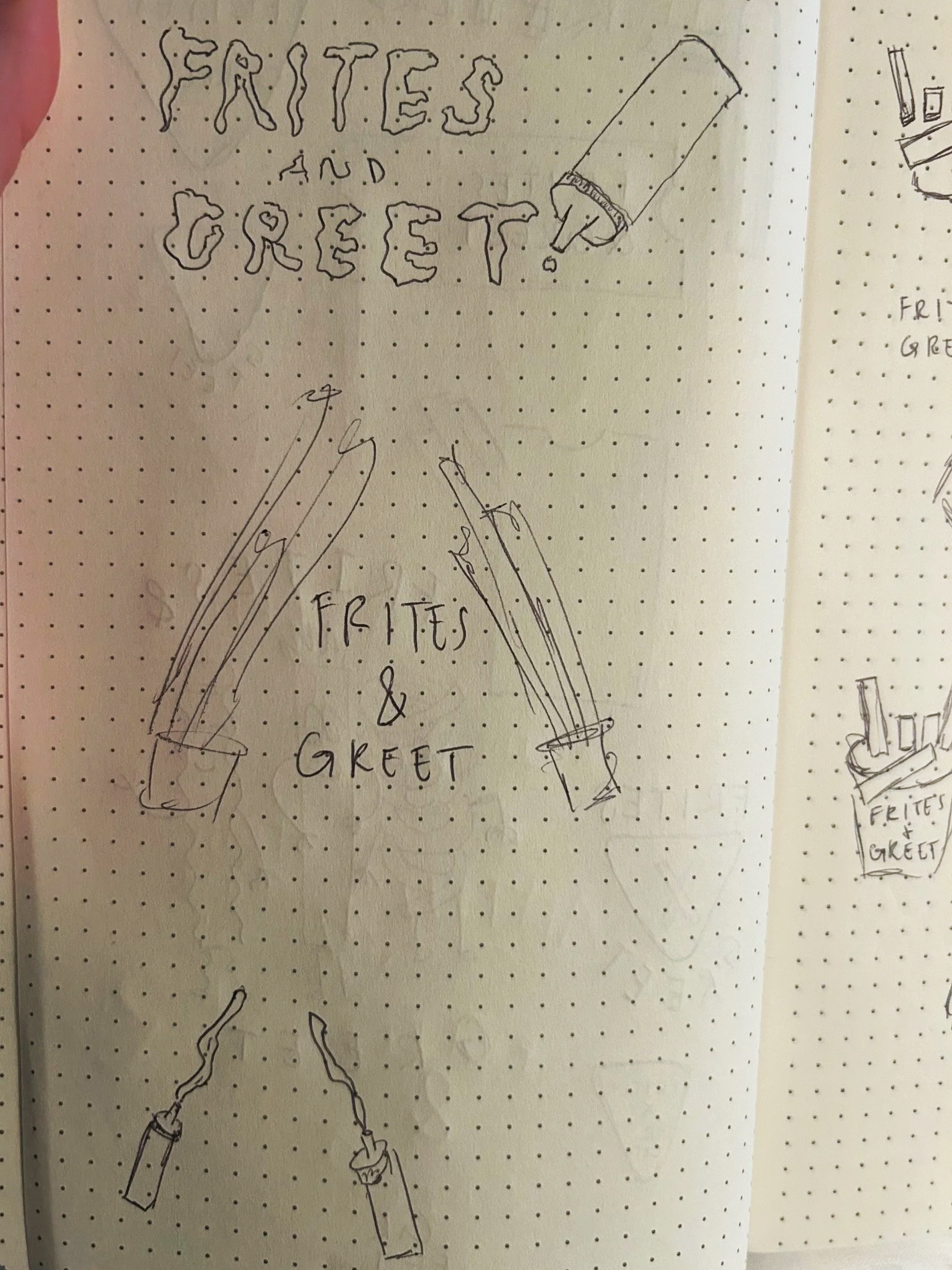
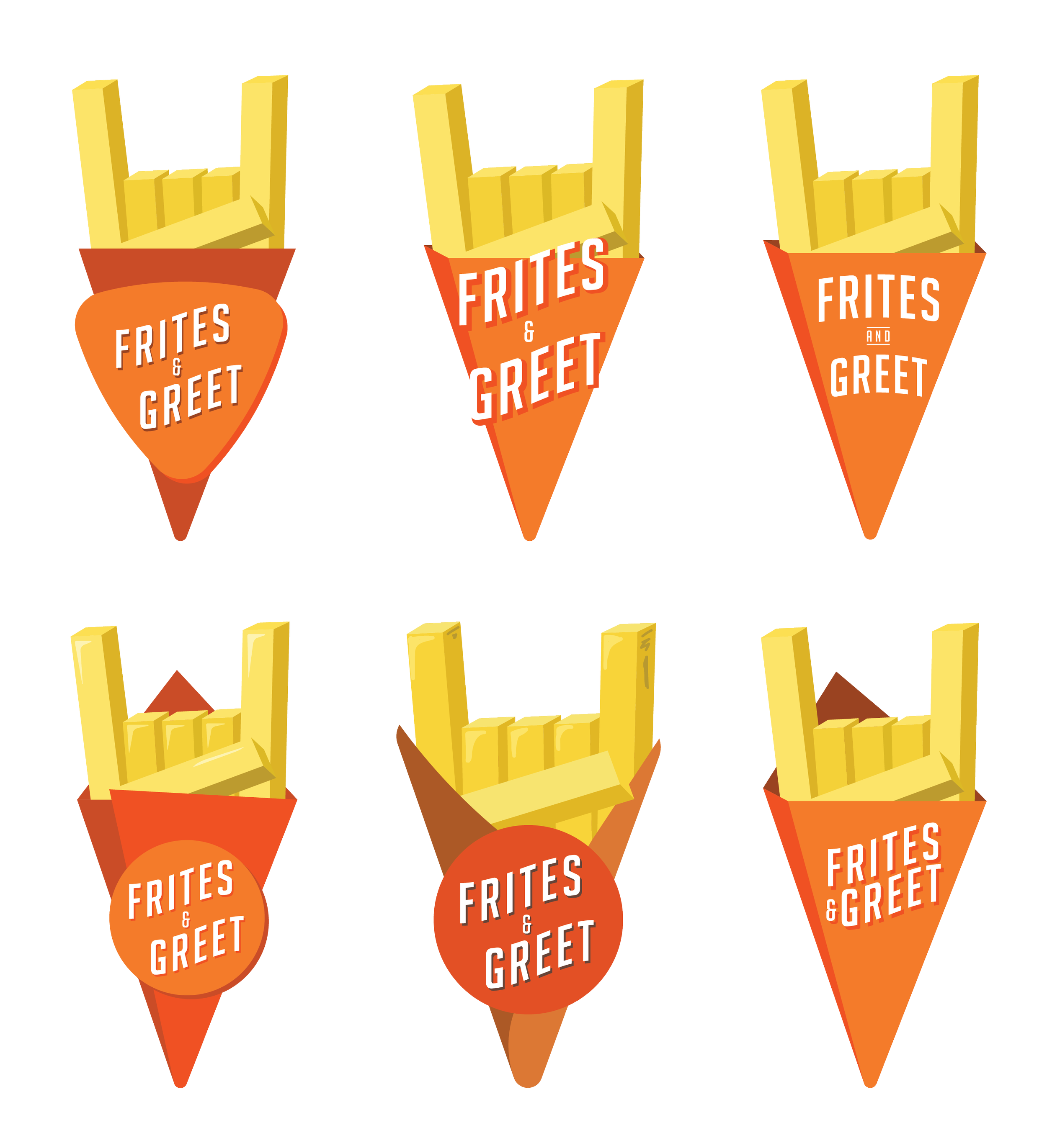
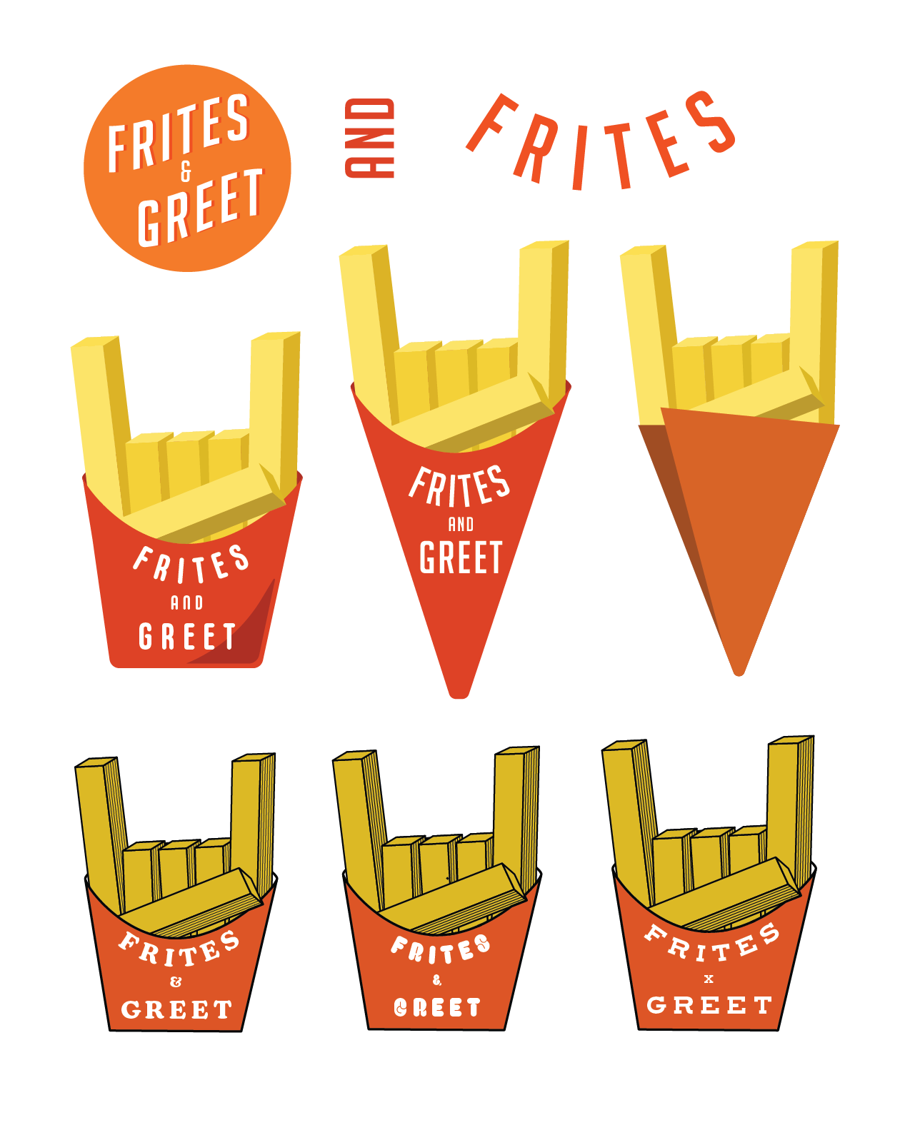
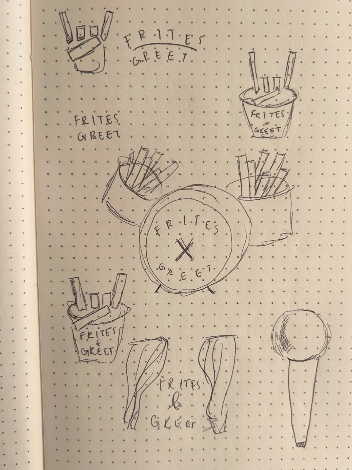
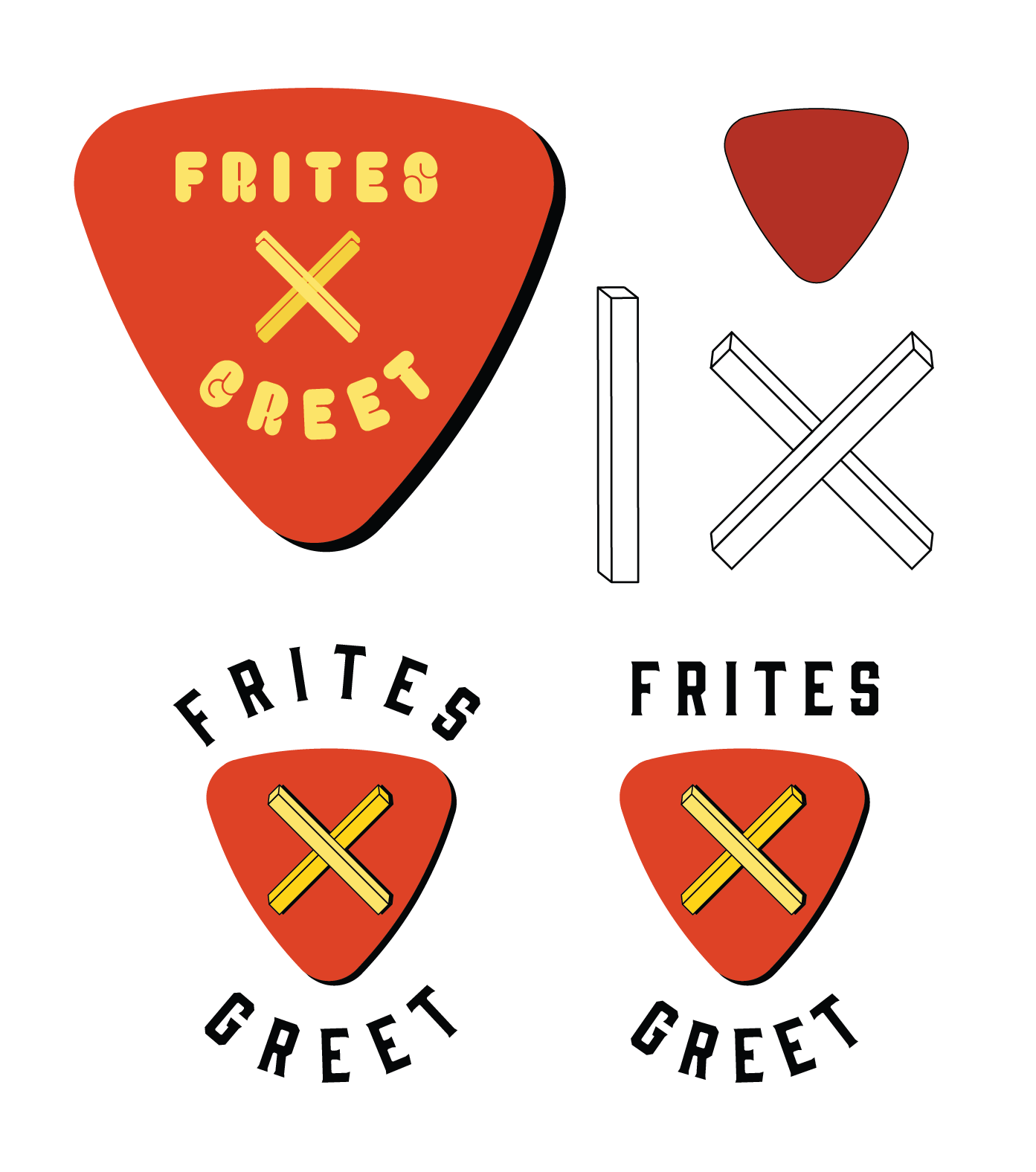
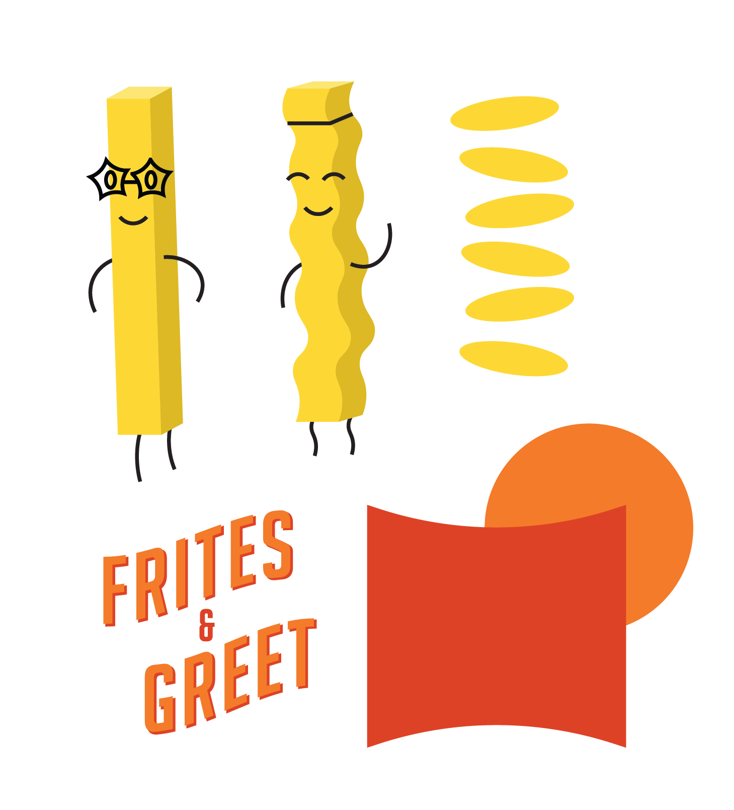
After hours of sketching, the idea for fries shaped like the classic “Rock On” hand symbol came to life. From there, I took the concept into Illustrator and kept iterating until the balance finally felt right, including some versions that somehow gained an extra finger along the way before returning to the proper five fry fingers. Once the logo landed in a strong place, it was passed back to The Anthem’s internal team for final production and rollout.
Sketch No. 1
Sketch No. 2
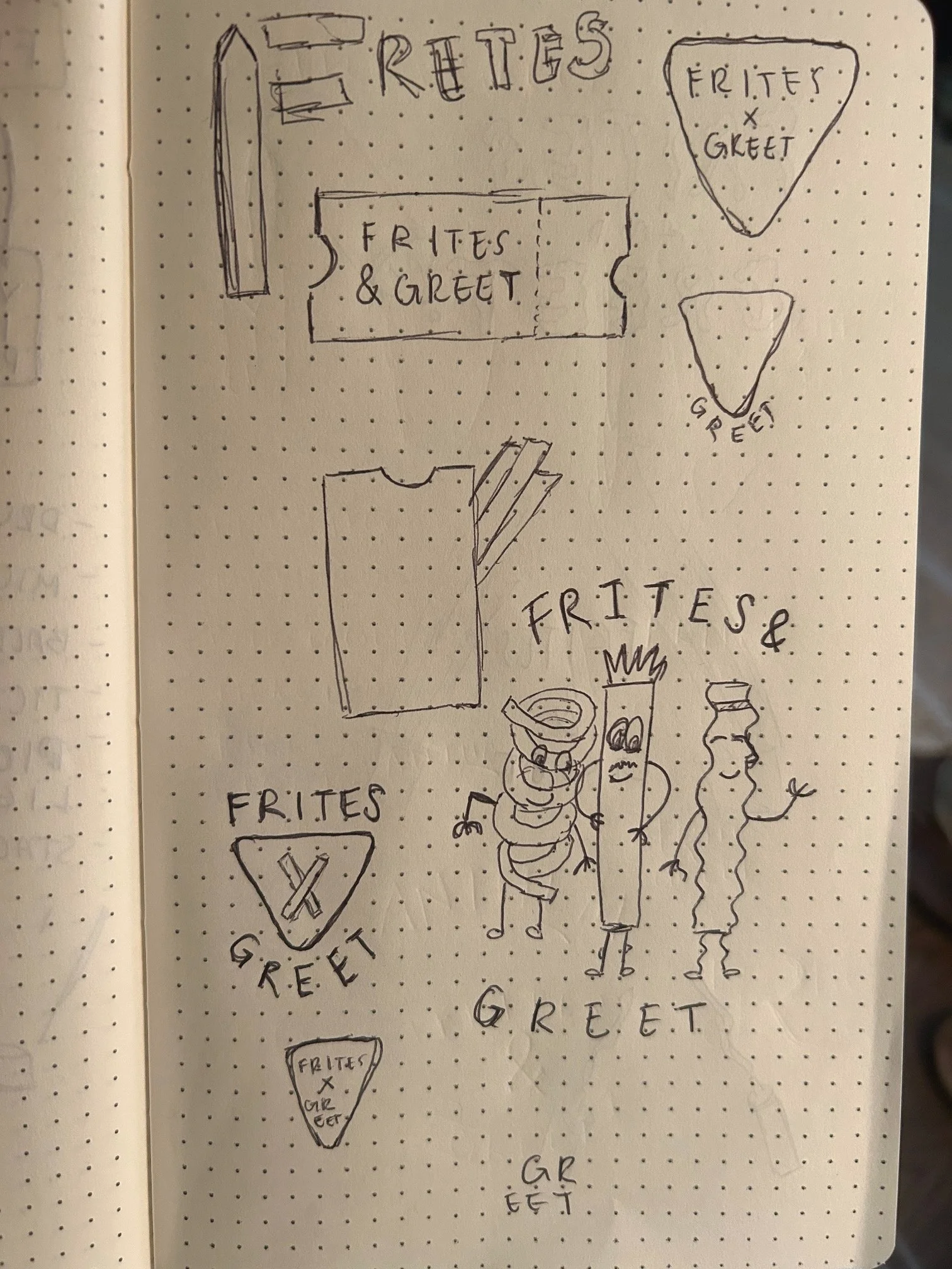
Sketch No. 3